September 30, 2011

Etsy Update

i've tried everything.. the random post-it-notes and lists, "daytimers", huge calendars on the wall/desk an ipad but nothing works for my like a good old fashioned art journal/calendar/schedule planner/all of the above! this is my 2011 fall planner and it keeps my on-time and up-to-date with all my everything's.. check it out

tabs show the month - for easy search and notation 

fun embellishments speak to me.. i love the colorful misting chipboard and this special geometric graph paper i made
the vintage lace is to amazing for huge POPs of color! looks very Novogratz to me.. don't you think they would carry a book like this to keep their 7 kids and design biz straight??

view from the top + all those colorful pages = yummy! 
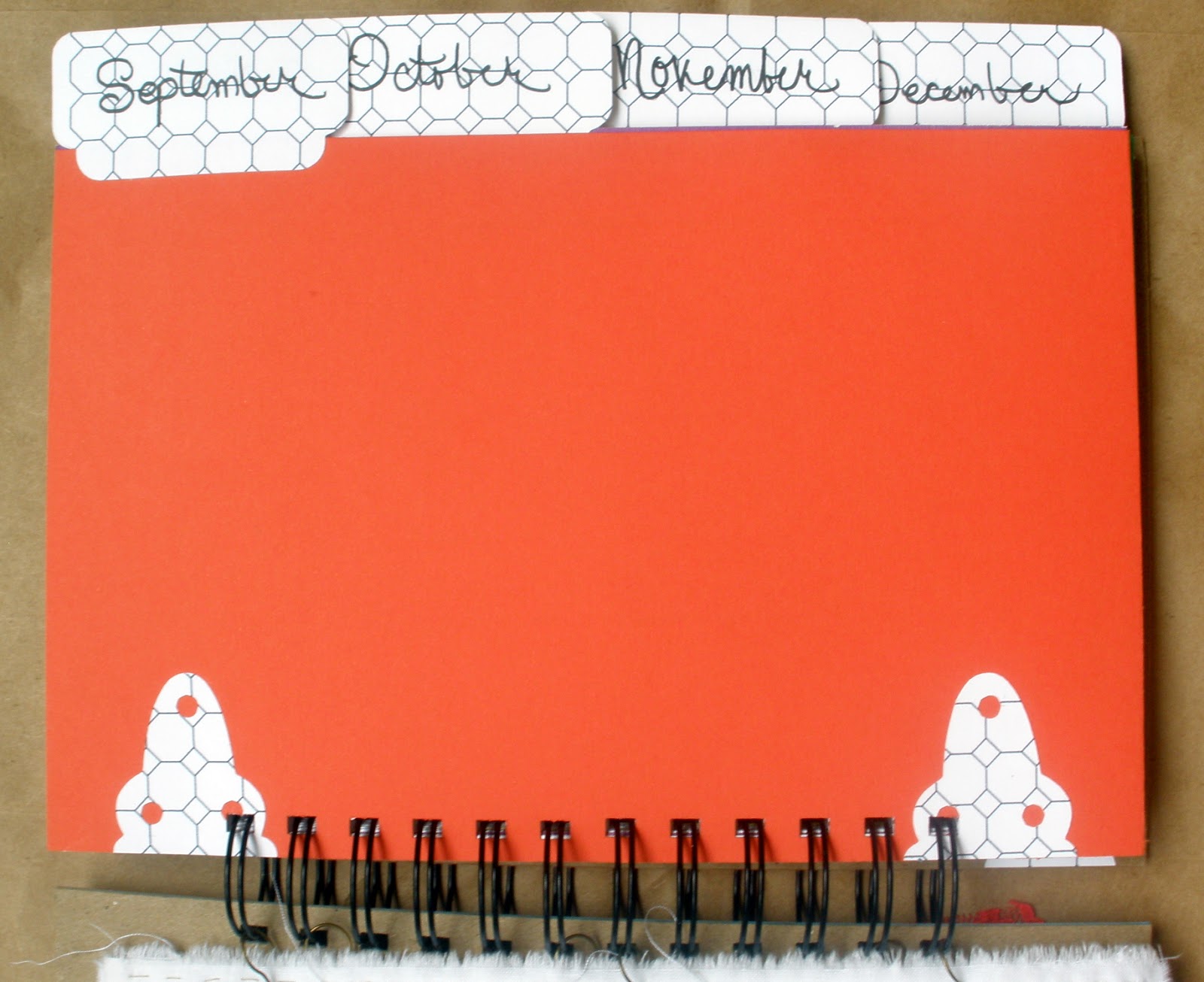
solid colorful divider pages with tabs 

the weekly template for the not so busy person.. it could be done by month or day.. but i like seeing the whole week..
week tabs by date - this is engineers graph paper i printed out

regular graph paper - so i can design layouts on the go, make random notes about projects or ideas

geometrical graph paper hinges = ♥ 

back cover 

what about you what do you use to plan your everyday? think this is something i should add to my etsy shoppe?.. would you be interested in a colorful planner? 

thanks for checking it out!

September 29, 2011

Spontaneity

spontaneity defines me or i define spontaneity? soon as i'm in love with one idea the next lures me in - which to go with? this is the question i'm putting to you (my lovely readers) do you like this look? although i terribly miss that very lovely Colorful Krafts header of burlap and felt.. (and i know some of you did too) i love the dynamic view's "snapshot" with magazine being a close 2nd - check it our for yourself at the top of the tabs bar - far left. what do you say dynamic view or burlap header?

September 26, 2011

Macy Monday

 for the back story of macy monday go HERE

this layout i reworked so many times - wondering if this really was the "right" paper to use - but just loved these colors so much i wanted to make it work with this amazing (cosmo cricket) boarder it says: "i treasure our memories and crazy times we are friends at heart and partners in crime" when i saw this border i knew it was made for this (most adorable)  picture! ended up l♥ving the eclectic fun feel it gives the layout! although i'm thinking a little journaling spot tag should go right above the title.. think i'll add that for macy - so she can write in a couple thoughts (didn't really think of that till i took this picture of the layout).. isn't it funny how things can look so different in a picture? just sitting on my desk i thought the layout was getting a little overcrowded.. but now i think yep - it needs that tag after all.. hehe

 the flowers are punches - and i used the scraps of the cosmo cricket border paper - which really helped give a TON of texture, color and patten to the flowers - some have writing on them and some have pattern - helps pull all the colors together!

 the chip (bo bunny)  i got on sale a while back and liked the fact that they are a little different and colorful again - pulling all the colors together blue and orange = yummy!


September 23, 2011

Exciting Etsy Update

oh my there is so much to show you i'm super excited about what's going on over at the Colorful Kraft's etsy site! this past week we had a photo shoot for a new item that's making its debut over on the site now! check it out HERE 
without further ado - this was our our photo shoot for these babies! 

fun right?!
here's the shoot

 warm & colorful yellow (might be my favorite)

Colorful Kraft's labeling/tag using kraft paper and branding sticker pinned on with a simple finding. this is how the headband will ship - of course its also bagged and boxed

Cool colorful Blue - would pretty much go with 80%  of all clothes i'm sure if it! after all don't we all wear jeans at least 80% of the time!

 by the way this is my sister in law (Nik) isn't she beautiful? love her gorgeous - oh so natural hair!

 ok i have to admit something - i made one extra each of the warm yellow and cool blue for myself cause i just l♥ve them so much.. you? 

this headband hits a more vintage vibe with its one of a kind styling and retro red lace banding and double flower which totally come off the band and can be clipped in your hair by its fancy lonesome or on a lapel or scarf! how fancy is that? - you could retro up anything! 

 ready for your personal touch - you ♥? of course you do! 

 this 1930's vintage broach set this headband apart from any other!

 again the flower totally comes off and can be pinned on anything - for a little vintage flair! i'm totally in l♥ve with this broach and flower headband - wish i had 2 of them so i could have one for myself - it would be perfect for anything worn this fall with all the holiday festivities coming up - this is sooo the missing element your fall wardrobe needs! 

 close up of the beautiful chocolate & golden 1930's flower center and headband 
 beginning to think yellow is my color - and with red lips (from what i understand is totally in for the fall) this is just the pop of color needed!  with vintage yellow edging ribbon burlap and pleated muslin this one is over the top picnic ready!
 just the band - no flower

just the flower - for those office kinda days that need a little extra spice!

just love all the colors the vintage broach flower center picks up in the light! 
 dusty pink = date night pizazz! this soft velvet headband speaks simplicity and romance

 with a vintage earring as the flower center its just enough bling to make even a bad-hair-day jazzy!

so which is your favorite? - And don't forget to check out the rest of the photos over at Colorful Kraft's Etsy Shoppe!

thanks for stopping by and commenting!

September 21, 2011

Layout of the Week

yay for more honeymoon layouts! this is another from the peppermill cafe we just kept going back for their fanfreakingtastic bloodymary's!

of course this time i was prepared and stowed away the most awesome napkins ever!.. arn't they fab?! 

a couple die-cut tags tucked away behind the picture of the interior of the cafe - with all their neon lights

gosh with handwriting like this i could have been a doctor! - so just in case you can't read my very smart writing... this is what the tag says: 
"what great memories food & dining at the peppermill restaurant finding coffee and more just lead me through their front door!"

and the 2nd die tag is a little check list - 

ok that's it for today - i'll see you friday for the most exciting etsy update so far! here's a little sneak peak


September 19, 2011

Macy Monday

MM is super special this week - not only is it a double page layout but its of macy's childhood pet and best friend gypsy. when she gave me all her 308,976,832 pictures to scrap these little pictures were in a ziploc baggie with a single post-it note stating "please use as many of these as possible!"so not to disappoint here is one loaded layout!

{sorry about the picture quality}

to start off the thing you have to understand about these pictures are.. they were in terrible condition. she had been storing them in one of those old fashion sticky scrapbooks ya know the kind you lift the clear sheet and stick down your cut up picture and stickers and call it a scrapbook - right! so all the 8 round pictures on the side were so cut up i reconfigured, styled and thought and thought about what to do - when i finally realized they all had a common +! i could punch them!! so boom bang and there ya go that cleaned them up really fast the 6 main pictures were the ones that were still in some kind of shape {some i double backed with cardstock} and there are 2 in such bad shape i hid them in the purple pocket - behind the top left picture - mostly to help keep them safe but i wanted to keep them all be together and lets face it - there was no way i could work them into the design. 

{left page}
the paper is s.e.i. and i had been saving it for ages to make "something" with and of all the 1000 million different papers i thought would be just perfect for this gypsy layout none of them were doing it.. i didn't want dog paper and all the black and white (just like gypsy) paper was to dark and gloomy.. no i wanted something bright, cheery that would give her (macy) the same feeling gypsy gave her. another reason - purple is her favorite color! this paper was the winner and ♥ the way it makes the pictures light up! 

{right page}
 the title chip board is covered in solid green cardstock but the chip itself i bought at Big Lots for $4 a huge stack of 12x12 chip with tons of alphas - this layout called for a huge title and these were perfect! 

 the whimsical flowers i'm in ♥ with! i cut them from the cardstock and used the leaves of about 4 different flowers to create a long steam 

macy i hope this page brings you warm fuzzy memories! cause i just fuv it..

September 15, 2011

Red Velvet ♥


Red Velvet Lookbook / Fall 2011 from elsie larson on Vimeo.

because i'm in l♥ve with a beautiful mess and red velvet shoppe i just had to share - how great is this video? those jeans with the ♥knees are seriously a must have in any fall wardrobe! of course green being my most favorite of colors (do i hear Ireland calling) that way retro olive green blouse with the cream collar yeah ok i'll take that!! - forget all those fab dresses! what's your favorite?

September 14, 2011

Layout of the Week


this week's layout is another double page layout of our honeymoon album i'm working on. the last several have been on red rock canyon but this next one is all about our adventures at the Peppermill Cafe and lounge. wow this food was down home cooking good! you ever make it to Vegas set some time aside and get a massive omelet and bloody mary its worth the 1hour reservation wait so worth it - we went back twice!  here's our time at the Peppermill! 

{left page}
the top left collage picture {in the hand-cut yellow frame} was from one of those guys that walk around and ask to take your picture and you always say no - ya know like at Disney - anyway we actually said yes this time and for staying up till 6am the night before (hey it was our honeymoon..) we looked pretty good!

{right page}
the large picture in the black frame was actually part of a folder with the Vegas night scape being the front cover of the folder - so i cut the folder in 2 and have the front cover on the left page and the picture on the right (its actually the same picture as in the yellow frame but since its a lot bigger it looks a little different.
can't leave out the handsome picture of eric & oh so large pint size bloody mary! i took that picture.. while waiting for food.
 
{double page layout}
the bloomers, hand-cut frames and die-cuts {which i just think are to fabulous!} and all the bakers twine i'm real happy with this double page layout

right here i just threaded the twine {with a very large needle} through the button and tied in a bow
i'm trying to keep this book real simple and clean with all the busy Vegas pictures and retro fun papers i think the design should stay clean - so just a few accents like this tip it over to the ♥cute scale fast! :)

the happy {and slightly hungover} couple
love the bloomers and flower chip framing our picture and the 2 for 20 cents sign pointing to the bloody mary i thought was to funny - it was more like 1 for $20!! hehe

September 12, 2011

Macy Monday

to see the back story on macy monday go here 

this might be my favorite macy layout yet!

so whimsical!


a little journaling spot (cause she loves that sort of thing) 
hope you love it macy.. as much as i do!