August 30, 2009
New Supplies!


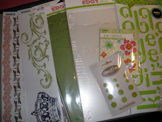
some new scrapbooking supplies! this is one of my favorite things about scrapbooking - shopping and finding new things to use. the puffy stickers are something i've never used and am looking forward to doing some amazing titleing with these, the new paint colors are going to be amazing with .. something.. and the pet cat rub-ons are going to be for a mini book about the two little furries in the house which i have the coordnating paper pack. so look for that book soon!
August 29, 2009
Journaling vs. Pictures
Journaling has always been my biggest challenge in scrapbooking - in most of my pages I don’t do any but as of late in looking back at some old books I’ve enjoyed reading any type of journaling from full on writing to a little quote. That got me thinking.. I needed to implement more journaling into my scrap booking. However, I seem to get stuck with how to journal, what to say + most importantly how to make it all fun to create and fun for the reader - later.
In order to get my mind thinking journaling I wanted to use the journaling itself as my inspiration vs. pictures like I normally would.
That’s how my “book of quotes” came into being.
This has been my constant project over the past couple weeks while looking through magazines and searching online for journaling inspiration.
The criteria for the book was: 9X9 pages, the colors had to be in keeping with the colors of my scrapbook room (black, white, grey, silver and pops of green), and the most important thing would be the quote itself that would inspire me to create a layout accordingly.
All quotes have the words: Create, Art or Paris
I'm Back
My goodness bet ya’ll thought I fell off the edge of my scrap chair! Sorry its been such a long time since my last post. I’ve been crazy ill and am starting to feel much better and will spend the rest of the afternoon updating my posts while blowing my nose and drinking hot tea!
August 13, 2009
Letters, Layouts and Colors
 Layouts, Letters and Colors these idea boxes have been so much help!
 The Layouts box is litterally that - layouts. I "copy" them from magizines, design some myself then draw 'em out on graph paper which I adher to a blank card. On the back of the blank card I write where i got the idea from and write each time i use that layout on what. All the layouts are organized by how many pictures that layout holds.
 Each numbered chipboard divider I made with black and what glitter paper from DCVW glitter
pack. The numbered tabs are made with my Cricut machine cartridge favorite things.
The Letters box is leftover letters (and some new) that I put in lower and upper cased tapped envelopes. Organized of course alphabetically, this makes it quick and easy to look for whatever letter is needed for a layout.

The Colors box is the most fun - I use this one for color insparation. Anytime I see a color combonation i like - normally in home magizines - I match the colors used in the insparation picture to paint chips. I then tape the paintchips to the outside of an envelope. The inside of the envelope is where I store the origional insparation page as a referance for how "they" used the colors. I have been known to take pages out of magizines jsut about everywhere - although i normally ask if the magizine is new...
Hope you find some of my organizing ideas helpful!
Messy Desk Top

This is the current condition of my desk top! quite messy, but i'm excited about the project i'm working on which i will post soon enough.
August 7, 2009
 Some people’s favorite childhood movies are “The Wizard Of OZ” some the “Goonies” maybe “Dirty Dancing” or the ever so popular “Star Wars” but my favorite growing up was by far “Mary Poppins”. the magical experience that is “supercalifragilisticexpialidocious”, “I Love to Laugh”, and “Stay Awake”… it’s mystical qualities its magical values and most of all the creativity and colors that inspires me. I decided to create a page to celebrate my enjoyment and love for the movie.
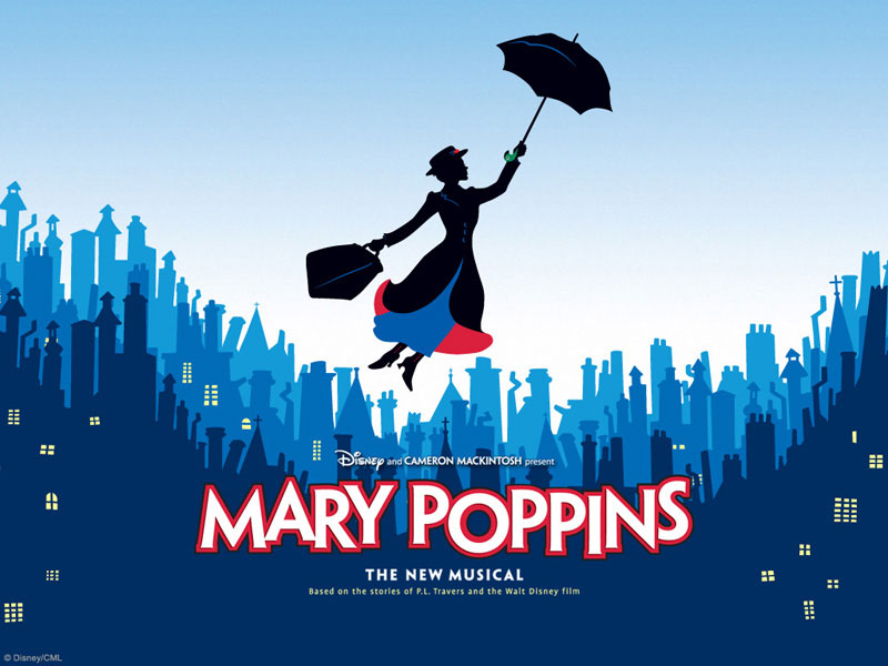
Normally, I use pictures as my inspiration in designing a layout, not having one this time I went online to search and the inspiration came from "Mary Poppins the New Musical".
 The city top I drew out by hand (while looking at the inspiration print on the computer) on a template then cut it out and used it to trace on the first color of cardstock and flipped the template each new color so each new city top cardstock didn’t appear the same. The “Mary Poppins” I printed out and enlarged with our copier and cut her out using and Exacto knife, then adhered Doodlebug’s crushed velvet to give her a “real” look.
 The print around the bottom of the page says “Last week I was having one of those “nothings going my way” days, I need a boost, I needed “supercalifragilisticexpialidocious” with a quick run to Best Buy I bought the 45th anniversary edition and have been loving it ever since.”
August 6, 2009

 Getting a GOOD picture of Alex is near impossible so when I captured these adorable shots of his expressive face close up I had to dedicate an entire page to them.
I decided to use black and white photos because the green grass was so bright it took away from his face, still wanting to use color I brought the bright back to add contrast using bright patterned paper and kick’n buttons.
The tag pictured is hidden behind the top left photo.
August 1, 2009
favorite family page


These are my favorite individual pages to date, for several reasons; they are beautiful old family photos and I tried something I hadn’t tried in a composition and design up to this point. I went with simple styling, using neutral colors and metal detailing which in turn I discovered showed the pictures and big type font in its own real element - you almost don’t notice all this little things going on, the pictures stand out and I love it!
Subscribe to:
Comments (Atom)


