palette #16
at the color room
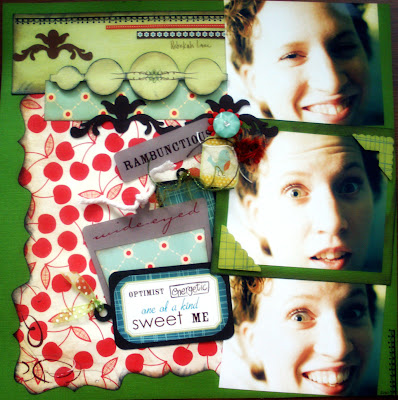
this is what i came up with
this is the first time i didn't take the insparation so literal.. i used it as insparation only
and i love the bright colors with a vintage/retro twist
this button is one of my favorite things of the layout!
and of course that tweet little birdie tag is a close 2nd!
i used a lot of die-cuts
also, i should admit it was the first time i've used him holts distress crackle finish.
in the past i'de always used inkadinkadoo's
rambunctious supplies:
paper: coredinations, diecuts with a view, cosmo cricket
rub-ons: colorbok, fancy pants, k&company, s.e.i
chipboard: k & company
cricut cartirdge: home accents: george basic shapes
stickers: cosmo cricket
corner punch: paper shapers
ribbon: misc unknown
paint: basics
ink: colorbox, tim holtz
crackle finish: tim holts


Rebekah, your site and designs are beautiful. Thanks for sharing with us.
ReplyDelete